The Space Between Languages Has a Job to Do
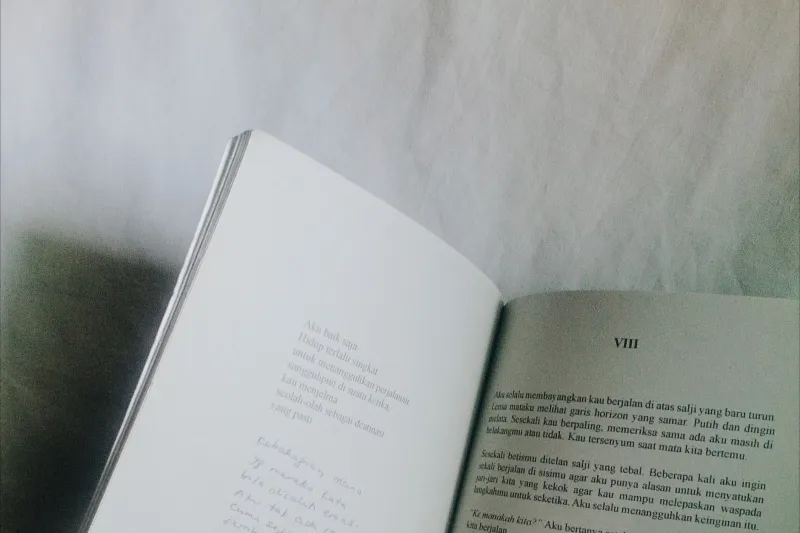
I keep a stack of bilingual poetry books on the floor beside my desk. Some are beautiful. Some are useful. A few are beautiful and useless, which is its own special category. I pull them down when I am trying to explain to a poet why the design of a translated book is not the wrapping paper around the translation. It is the translation, or at least a big loud part of it.
The gutter is not a border. It is a shared hallway. If the two languages cannot walk through it without bumping elbows, the book fails before the reader reaches the second poem.
Start With the Reader's Eye, Not the Spine
Most facing-page bilingual books announce their intentions on the first spread. Original on the left, translation on the right. Or the reverse. Either way, the reader is being told what to do: read this first, then that. There is no neutral choice here. If the translation sits on the right, it feels like the destination. If the original sits on the right, it feels like the authority. Designers should make that choice on purpose, and poets should ask why.
The common mistake is to treat the translation as a comment on the original. You can see it in small type, italics, or a narrower measure. The translation gets squeezed into the leftover space like a footnote that learned to stand up. Do not do this. If the book is truly bilingual, the two poems need equal visual dignity. That does not mean they must look identical. It means neither one should look like it is apologizing.
A baseline grid helps, but do not become a martyr to it. Line-by-line alignment is lovely when the syntax cooperates. When it does not, forcing alignment turns the page into a spreadsheet. Align the first lines of stanzas, keep the leading consistent, and let the poems breathe. The reader will forgive a translation that runs three lines longer. The reader will not forgive a page that makes the poem look like a form to fill out.
Margins Are Part of the Translation
Facing-page books need a generous gutter. This is not a luxury. It is a physical fact. The binding eats the inner margin, and poems are not paragraphs. They do not like to be pushed into the crease. A tight gutter makes the reader tilt the book, and a tilted book makes the poem feel like a secret.
For a typical 6-by-9-inch poetry book, the inner margin should grow with the page count. A slim chapbook can survive a smaller gutter. A 300-page collected poems cannot. Print-on-demand templates often use the same margins for a 90-page book and a 400-page book. That is one of the reasons so many self-published bilingual editions feel cramped. If you are designing your own book, order a physical proof. Do not trust the screen. The screen has no spine.
The outer margins matter too. They hold the reader's thumb. They also hold the silence around the poem. In a bilingual book, that silence is doing extra work. It separates languages without building a wall. I like a slightly wider outer margin than I would use in a monolingual poetry book, especially when the source language uses a non-Latin script. The page needs room for the eye to rest between alphabets.
Line Breaks Deserve a Second Draft
Poetry designers get nervous around line breaks, and they should. In a novel, a line break is a layout event. In a poem, it is a meaning event. When a translation line is too long for the measure, do not shrink the type until it fits. Do not hyphenate. Do not justify the poem into a block of brickwork. Let the line wrap with a hanging indent, or adjust the measure, or talk to the translator about a different break.
The same goes for stanza breaks. If the original has white space, the translation needs white space. If the translator has combined stanzas for clarity, the page should not hide that decision. Use a little more leading between stanzas than you think you need. Poetry readers are sensitive to air.
For Chinese poetry, character spacing can be part of the music. For Spanish, the long line may need a wider measure than the facing page allows. For Arabic or Hebrew, directionality changes the whole spread. These are not decorative problems. They are translation problems wearing design clothes.
The Apparatus Should Know Its Place
Introductions, notes, acknowledgments, and translator's afterwords are part of the book, but they should not ambush the poems. A brief headnote can be generous. A footnote on every page can feel like someone whispering during the reading. If the notes are essential, group them at the back and mark them lightly. If they are not essential, cut them. The poem is the main event.
Running heads are a small place where translators often disappear. Put both names where they belong. The title page should make the translator visible, not just the author. This is not charity. It is accurate labeling. The book is a collaboration, and the design should say so before the reader reaches the acknowledgments.
Three Tests Before You Upload
First, photocopy a spread and read it in bad light. If the gutter swallows the first word of every line, fix it. Second, read a poem aloud while holding the book open. If you have to fight the binding, the binding is winning. Third, hand the proof to someone who reads the source language and someone who does not. Watch where their eyes go. The page will tell you what it is teaching.
This year I have been trying to remember that book design is not the last step in translation. It is one of the first places where a translator's choices become visible to a reader who will never compare the two texts line by line. The space between languages has a job to do. Give it room, give it dignity, and do not make either poem kneel.